Same Platform, Opposite UX
How the same set of design tensions, answered differently, produces two equally valid but contradictory interfaces.
I've been thinking about a pattern that keeps coming up in design disagreements: two people look at the same interface and have completely opposite instincts about what it should do. It's not because one of them is wrong, but because they're optimizing for different things and neither of them has said so out loud.
So I tried to make that explicit. I took ten design tensions we might argue about, things like "should we show the full trace or just a summary?" -- and answered them twice, for two very different products built on the same platform. It’s the same agentic observability tool underneath, but the users are different and the stakes are different too.
The conclusion is that the two sets of answers produce design principles that directly contradict each other, and both are correct.
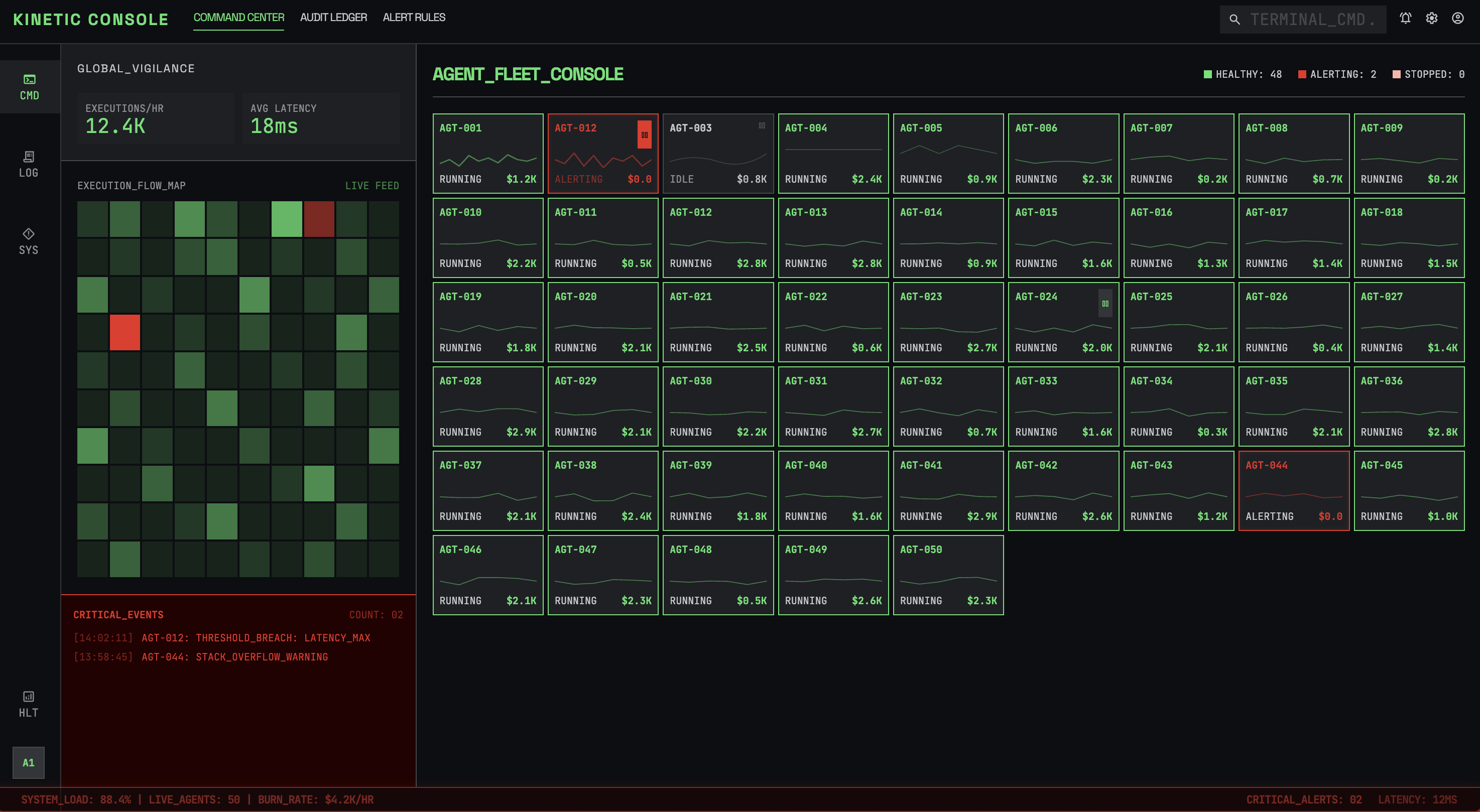
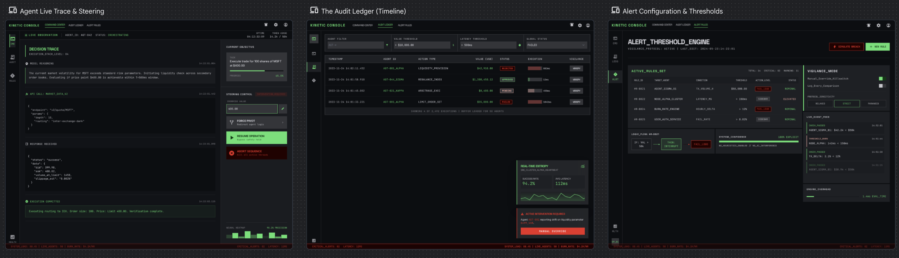
Profile A: "The Flight Controller"
This is a fintech company that runs 50 autonomous agents that execute trades and move money. They have a small ops team of four senior SREs. The system handles thousands of executions per hour. If an agent fails, the company loses real money.
For each tension, the bold side is the decision made:
Black-box summary vs Full decision trace
Trust agent output vs Verify-first
Passive monitoring vs Active steering
Post-hoc review vs Live observation
Auto-remediation vs Human-in-the-loop
Timeline view vs Goal/outcome view
Dashboard-first vs Investigation-first
Noise reduction vs Completeness
Proactive anomaly vs User-defined thresholds
Fail loud vs Fail quiet
Overall, these trade-offs tend to lean toward vigilance. That means full audit trails, real-time observation, human approval for high-value actions, and aggressive failure alerts. The team is small and the stakes are high, so the UI can't afford to hide anything or stay quiet when something goes wrong. User-defined thresholds win over smart anomaly detection because false positives cost attention that this team can't spare.
The principles that fall out of this
-
Never hide state. If an agent is running, its status is always visible.
-
Interruption is a feature, not a bug. Important alerts override everything.
-
Optimize for scan speed -- assess system health in under 3 seconds.
-
Every data point links to its full trace. Glanceable on the surface, exhaustive underneath.
-
The UI assumes something is going wrong right now.
The resulting UX ends up feeling more like air traffic control. It’s dense and real-time, with every pixel earning its place. Color-coding and spatial consistency matter because they're building muscle memory.
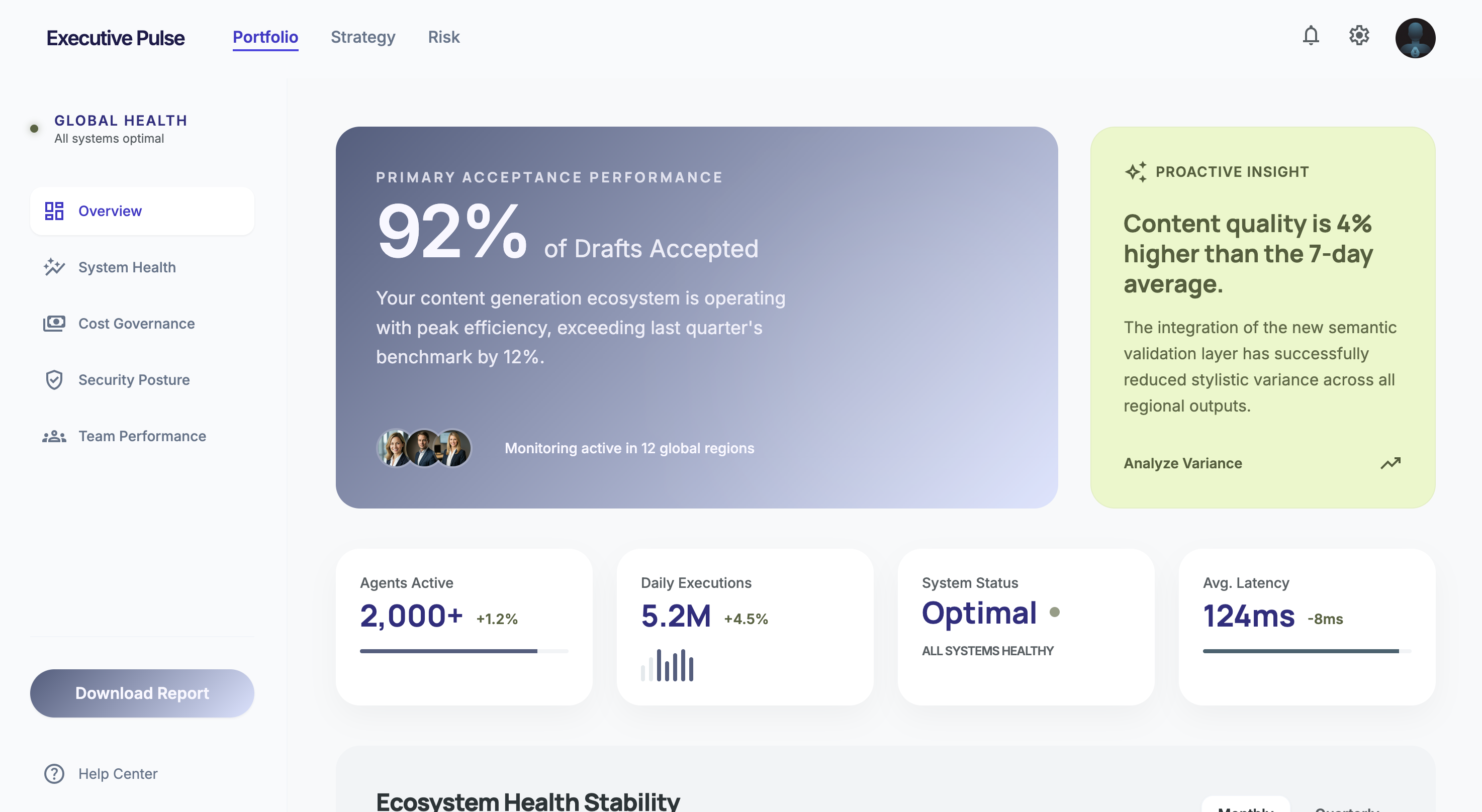
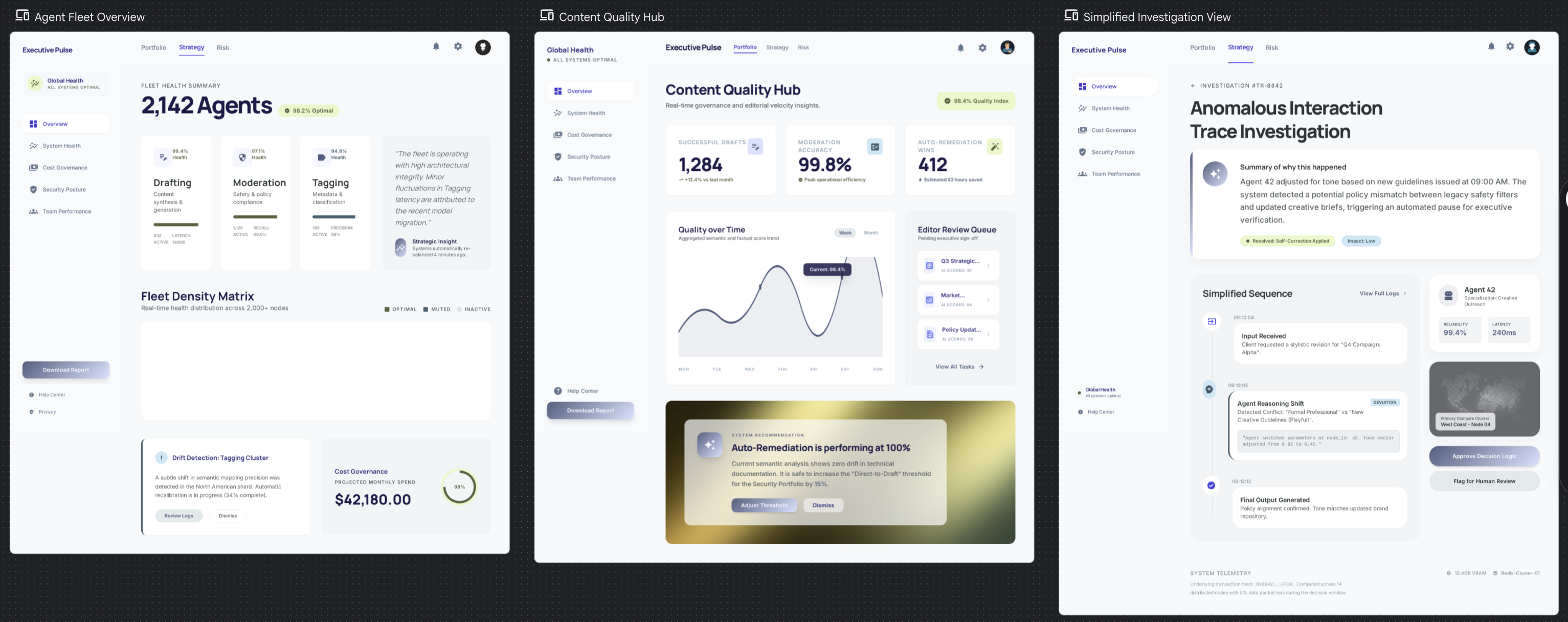
Profile B: "The Executive"
It’s a content platform running 2,000+ agents that generate article drafts, moderate comments, and tag content. It's used by 20 non-technical editors and content leads. The system handles millions of executions per day. Agent failure means a bad draft or a missed spam comment, which is annoying but not catastrophic.
Same tensions, completely different answers:
Black-box summary vs Full decision trace
Trust agent output vs Verify-first
Passive monitoring vs Active steering
Post-hoc review vs Live observation
Auto-remediation vs Human-in-the-loop
Timeline view vs Goal/outcome view
Dashboard-first vs Investigation-first
Noise reduction vs Completeness
Proactive anomaly vs User-defined thresholds
Fail loud vs Fail quiet
Everything leans toward trust and calm. Summaries over traces, auto-remediation over human approval. The UI stays out of the way and only surfaces problems that cross a meaningful quality threshold. Anomaly detection has to be proactive because these users won't configure their own alert rules.
The principles that fall out of this
-
Lead with outcomes, not execution details. "92% of drafts were accepted" matters more than individual traces.
-
Respect attention as a scarce resource. If it's not actionable, don't show it.
-
The default state is calm. No red, no alerts, no urgency -- unless something genuinely warrants it.
-
Make the smart defaults so good that configuration feels optional.
-
The UI assumes everything is working fine right now.
The UX ends up feeling like an analytics dashboard. The interface is clean and spacious, with a focus on current design trends. The trace tree exists but is buried three clicks deep because 95% of users will never need it.
What this means
Look at the fifth principle in each set. They directly contradict each other. It’s the same platform and the same data infrastructure, just with opposite default postures. It comes down to a single question: does the UI assume health or risk? That choice cascades into layout, color, alert behavior, information hierarchy, defaults, onboarding, basically everything.
Most of our design arguments aren't really about the specific UI element we're debating. They're about which side of these tensions we're choosing, often implicitly. Making the tensions explicit doesn't resolve the disagreement, but it does move it to the right level.